
1. Explain how you showed the meaning of each word.
- I showed the meaning of the word by making the word "loud" huge and in bold.
2. What was the most challenging part of creating your word illustrations?
- The most challenging part of this creation was to fit all of the letters on the page while making it seem big and loud.
3. Did you participate in a critique? Was this helpful for you? Why?
- I did not participate in the critique because I was in the process of making this one.

1. Explain how you showed the meaning of each word.
- I showed the meaning of the word by having the work "mirror" placed upside down and backwards like how a mirror would show a word.
2. What was the most challenging part of creating your word illustrations?
- The most challenging part for this word choice was to remember to push "shift" when making the word bigger.
3. Did you participate in a critique? Was this helpful for you? Why?
-I did not participate in a critique because I was trying to get comfortable with adobe illustrator and figuring out how to use it.
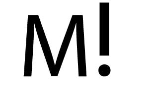
1. What qualities does your logo have that makes it successful? Explain.
- My logo is successful because it includes the M for my first name and for the I i put it as a lower case i and turned it upside down to make it look like its yelling M
2. What part of creating your logo was the most challenging?
- The most challenging part was trying to chose a font that looked like an i but also a !
3. What would you do differently?
- If I had to change it, I would try to find a more exciting font that would work
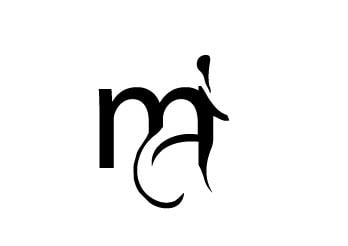
1. What qualities does your logo have that make it successful? Explain.
- My logo is successful because it is entertaining to look at and includes the m and I of my initials.
2. What part of creating your logo was the most challenging?
- The most challenging part was to make the letters still look like letters.
3. What would you do differently?
- If i had to change it, I would try to make it less busy.
